
See Part 1 if you haven’t read it for some background. In this post:
- Interface improvements
- Aero Glass
- Ribbon
- Backstage
- Animations tab
I’ve had about 4 days now to play with the Office 2010 Technical Preview, which, according to Ars Technica, is actually a slightly older build than the most current one, and for which testers were “hand-picked”.
I did end up installing both the 32-bit and the 64-bit editions of the software, realizing that I wanted to see whether 64-bit was stable (and it seems to be). When I discovered that Office 2010’s PDF export functionality is terribly inferior to Adobe Acrobat (more on that later), I went back to 32-bit so that the Acrobat add-in would work, but discovered to my horror that it crashes Word (but more on that later).
Let’s get started with some fresh content about interface improvements. LOW-BANDWIDTH WARNING: there are a LOT of screenshots.
Interface improvements
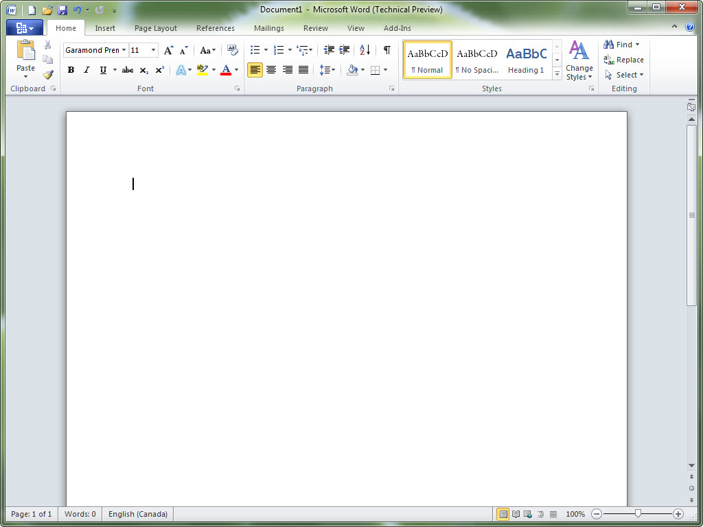
Indeed, Office 2010 is even prettier than Office 2007, at least in my opinion. The splash screens are now animated.
On Windows 7, the titlebar blends seamlessly into the application, taking the Office 2007 look a bit further by merging it with Aero Glass. It’s a nice change.

Tip: on my blog, you can click on any image that links to the picture to see a larger version.
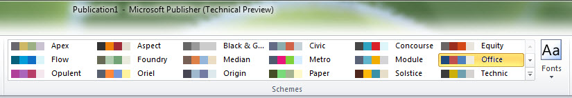
Some people don’t like how the colour is now white, but I don’t mind it at all. I just wish the colour schemes were actually available. In Office 2007 there was a choice between Blue, Black and Silver.

Ribbon, Ribbon Everywhere
The ribbon (also known as the Fluent UI) is now extended to Outlook and Publisher as well. (In Outlook 2007, messages and composing would take place in a window with the ribbon, but the application itself was ribbonless.)

Unfortunately, the ribbon seems to complicate Publisher, allocating valuable screen space (of which people have tons these days) to tools that will be used once or twice in the life of the workflow.

More follows the jump.
Backstage area
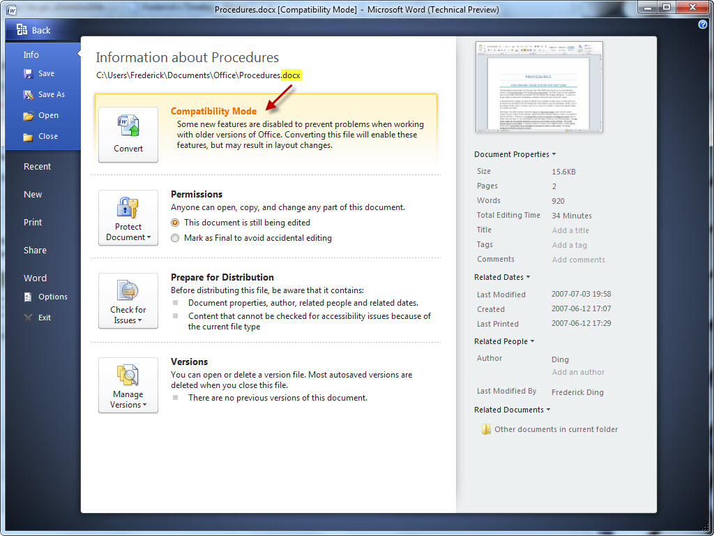
One of the most major changes is the new Backstage view, where the Office button leads to something that covers the entire window as opposed to a menu. (The screenshot below was taken in Microsoft Word. Interestingly, new features must have been added to the .docx format, since a .docx file from Word 2007 shows an option to “convert” it to enable the 2010 features.)

The Backstage view enables one of the coolest UI improvements: printing. Instead of a pop-up prompt for printing and a separate option for print preview, the Print view integrates both into one beautiful and easy-to-use screen.

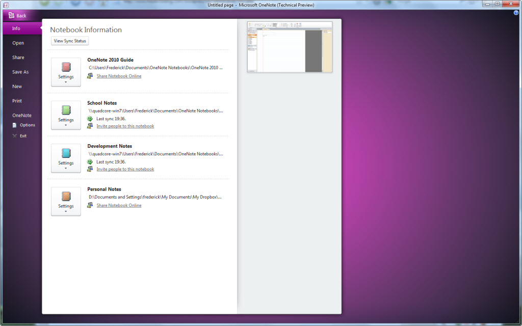
One cool thing about Backstage is that it’s colour-coordinated with the applications’ icons. Word, which has a blue icon, naturally has a blue Backstage area, whereas OneNote, for example, has a beautiful purple one.

Quite unimportant indeed.
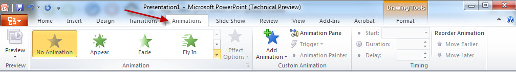
New Animations tab in PowerPoint
In PowerPoint, the animations and transitions have been separated into independent tabs, making it easier for users to add and change animations.

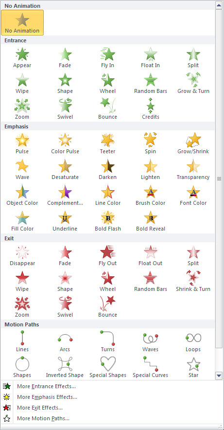
The drop-down shows neat graphical representations of the animations.

More about actual feature improvements is being drafted right now; that’ll come in Part 3!
Appendix: gallery of screenshots used in this post


All I can say is LOL, LOL, and LOL. And maybe a ROFL. You are hilarious, in your funny little way.