Note: this is being posted from Windows Live Writer Beta, so please forgive any layout or text issues; if there are any, they speak to the interoperability of Windows Live Writer Beta and WordPress 3.0.
I’ve been using a subset of the new Essentials suite (beta) for the past few days. There are good things, and there are bad things. In this post, I’m only going to focus on the new Windows Live Messenger, about which I have numerous complaints.
Overall UI
Messenger has been cleaned up a lot since the previous version. The look is brighter and simpler — I dare say, cleaner. Microsoft went with a simple, bright white look instead of the faint blue gradient that was featured in Wave 3.
Full (social) view
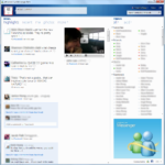
The default look in Messenger is a large window showing contacts on the right and a wall of updates on the left relating to status messages and social networks. Windows Live profiles can now aggregate content from Facebook, Twitter, Digg, other networks, and even RSS feeds, and this full view seems to support Facebook and Myspace.

I dislike this view a lot, because in my mentality, Windows Live Messenger is an instant messaging application; I could care less about status updates. Certainly, I do not want status updates to take up more of my screen real estate than my contact list. Of course, if you link WLM to Facebook, you get a slightly more useful updates as follows:
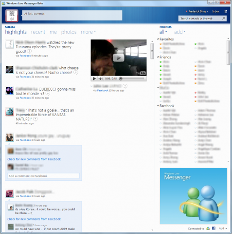
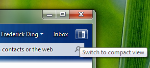
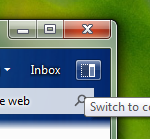
As a result, I use the compact view. There is a button in the main window to switch between the two views.
Compact view
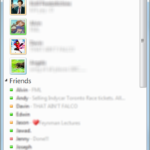
This look is more akin to the old-fashioned contact list we’re familiar with. The view here, of course, is customized to my liking. While I appreciate the no-nonsense look here, the ads at the bottom are just slightly distracting and annoying.
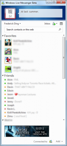
One of my minor complaints about the new look is the coloured ring around the display pictures of contacts. In previous versions of Messenger, they were bright and distinguishable. Now, it’s rather difficult to distinguish the green of ‘online’ from the blue of ‘offline’ and the orange of ‘away/idle’ from the red of ‘busy’.

Tabbed chats
This is one of the best innovations in this version of Messenger, and it conveniently eliminates the need for unofficial hacks like Messenger Plus (although Messenger Plus is still useful for encrypted chat logs, which Messenger does not support to this day).
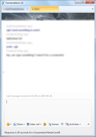
Unfortunately, I don’t seem to be able to drag a tab and detach it from the window. Ars Technica reports that it is possible to do so only by right-clicking a chat and choosing to undock it, but it is not possible to then combine undocked chats to create separate windows for separate categories of instant messaging dialogues.
Windows 7 integration
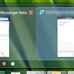
It was extremely annoying in Wave 3 that Messenger was identified as 2 windows by the taskbar (and by the Flip 3D window switcher). Wave 4 has fixed this issue and added better taskbar integration, with coloured icons to change one’s status.
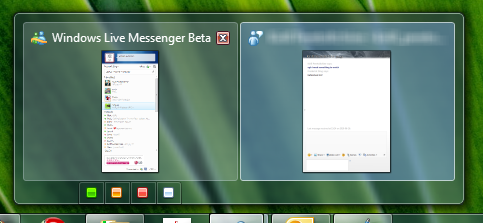
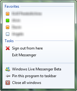
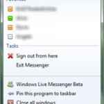
The right-click menu on the taskbar icon in Windows 7 also has quick options to start chats with favourite contacts, sign out or exit the application. This is really useful when the main window isn’t open, and is also a quick way to terminate Messenger (there’s no Exit option in the File menu of individual chats).
Critical changes that may make me stop using Windows Live Messenger
Handwriting
In previous versions of Messenger, there was always a Handwriting tab in instant messaging chats so that one could quickly and conveniently send ink messages. I don’t think anybody uses it nowadays for handwritten messages (considering the small number of Windows-based tablets in the market) but it has come in quite handy for mouse-drawn sketches.
I’ve used it extensively for illustrating simple graphs, diagrams, or even flowcharts. Example: curves in economics:
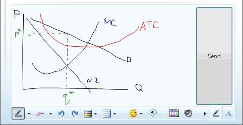
Not having this in Windows Live Messenger Wave 4 means: not only I can’t send them, no one can send any to me — even if they really are just sent as images.
Update (June 27): there’s a thread on one of Microsoft’s sites where this is discussed; a Microsoft representative explained why it was removed.
This is inconvenient to the point that I need to draw things in Paint and send them over photo sharing or look for 3rd-party online whiteboard tools.
Link redirection
This is the biggest issue I have with Wave 4. It seems that clicking on links in Messenger chats sends me through a transparent* redirect through a Microsoft-owned domain called rdir.us. Generally, it turns a hyperlink like http://www.google.ca/ into something more like http://rdir.us/?l=http%3a%2f%2fwww.google.ca&h=P7EAwkjXoRug38Nw8P6JID7b86dBALSnm4DSbAQcGQs%3d&p=1.
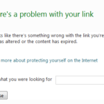
- transparent only in certain instances. On other occasions, harmless URLs (like this one) have an intermediate page: (all of the following screenshots are from Mozilla Firefox)

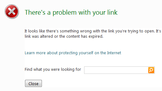
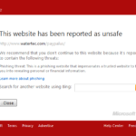
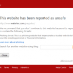
I can understand why this redirect may be necessary. For example, when I click on a malicious link, the redirect prevents me from going through and instead shows a warning screen:
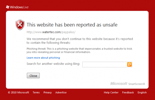
However, this is worrying for a few reasons. First, I have no idea what that hash in the URL is; does it identify me or the person who sent the link? Secondly, is Microsoft logging all the click-throughs, and knowing what sites users visit? (I suppose they could do this already by keeping records of all instant messaging chats, but this takes it even further.) Thirdly, why is this redirect necessary, if most modern browsers (Firefox, Chrome and even Internet Explorer) already have this filter?
I don’t want Microsoft to intercept my visits, nor show me a Bing search bar whenever something breaks.
Conclusion
While I readily admit that Windows Live Essentials Wave 4 has made strides forward in certain areas, like integrating social networks, I also think Microsoft has made some pretty notable blunders in their conscious decisions to add link redirects and remove handwriting support. If you want to avoid these things, it looks like you need to stay on older versions of Windows Live Messenger.
For more reviews, read Ars Technica on Messenger Wave 4 or Paul Thurrott’s Supersite for Windows.













I agree with everything you said here, the drawing feature was pretty much one of the only things I used in msn, it was stripped down in the latest version, whereby you could only draw less lines then originally, but removing it will most certainly remove my from using it.
Exactly the same. Stupid ctrl+z bug and limit BS killed it for me in wlm2009. But if handwriting is gone i’m gone.
Hm, interesting. What is this Ctrl+Z bug?