iOS 7 icons: you can’t be serious

I’ve been a proud Android user for years. Yesterday, I became even stauncher of a loyalist.

I only had to look at some of the incredibly stupid decisions Apple made with its iOS 7 redesign. There’s no need for me to write a long rant because that’s already been done — by countless individuals.

Basically, there was nothing significantly innovative in this iteration, and the design is now a horrible, inferior mixture of Windows Phone/Metro, Android, and WebOS.

Just compare the icons of “stock” apps on Android 4.2.2 (on my Nexus 4, left) vs iOS 7 (from the Apple site).
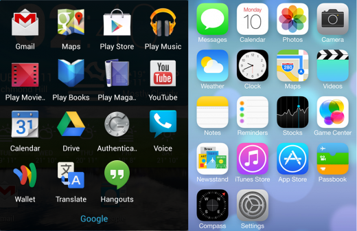
Both sets have moved away from skeuomorphism, but Android's is more professional
Both sets have moved away from skeuomorphism, but Android’s is more professional

The legacy rounded corners in the iOS designs, the mid-2000s gradients, and bubbly, cartoonish icons don’t fit the image of a polished operating system. The roundness of it all is really bad considering the emphasis on flatness in the calculator and call screen (or FaceTime incoming screen).

What really struck me was the redesign of the 4 core dock icons. I don’t think I’m crazy in picking stock Android over iOS 7 on this one:

A typical set of Android dock icons compared to their iOS 7 equivalents

Don’t get me started on how cluttered Control Center looks.

I’ll just leave you to read a “quick feature comparison” between iOS 7 and Android.

TL;DR I’m not impressed.

Happy New Year!

It’s the end of another year and the end of a ground-breaking decade. Let’s look back at what’s been accomplished in the years of 2000–2009, focusing on technology.

Technology

Windows has entered a new era

The decade—indeed, the century—began with Windows 2000, which I consider the first great version of the operating system. XP was the version that brought widespread success, and people just seem to refuse to upgrade; even today, almost three quarters of the computers on the net are on XP.

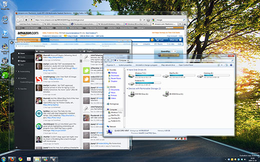
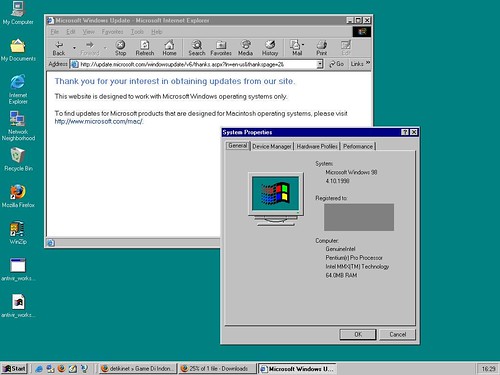
Despite the dismal failure of Windows Vista, it too brought change, which was followed by the enhancements of Windows 7. Compare my desktop today to the ugly screens of a decade ago:


Microsoft Store
Windows 98 desktop screenshot

Apple deserves an honourable mention for the ground-breaking work they’ve done on the Mac, elevating it to a newly trendy status.

Portable media players have completely changed

A decade ago, CD players and tape-based Walkmans were still the norm for ‘portable’ audio players. The iPod, launched in 2001, entirely changed the game. (I suppose this and the iPhone were the “comeback of the decade”.) It was no longer a device that played removable media. That was followed by thousands of other portable media players, to which the public generally refers inaccurately as “MP3 players”, reflecting the popularity of the 15-year-old MP3 format that has also been notorious for illegal file sharing (see below).

Cell phones and mobile devices have become ubiquitous

These devices used to be ugly, huge and heavy objects. As we move into 2010, cell phones have become more compact (usually this means thinner and lighter) and more powerful.

In China, about 739 million people have cell phones; that’s more than there are Internet users in China (which is about 360 million).

Mobile devices have become truly powerful. The iPhone, purportedly the most popular cell phone of 2009, is one of the biggest platforms for software development. And it has a touch screen. RIM’s BlackBerry, initially launched in 1999, is the most popular smartphone among business users.

Ordinary people begin to embrace ultra-portable netbooks for lightweight computing. The move to mobile is probably the most noticeable trend in end-user gadgetry in this decade.
Continue reading “Happy New Year!”